The Importance of Typesetting: A Guide for Nonfiction Authors
You’ve worked very hard for months if not years to complete your nonfiction manuscript, and now that you’re done with your final editing pass, you feel a tremendous sense of accomplishment.
You’re proud of your work, which will establish your bona fides as an expert in your field, and you’re ready to publish your book asap.
But, have you taken the time to consider how your final design will impact your book’s readability and, by extension, your credibility?
In this article, we’ll dive into the world of typesetting and explore why it’s essential for nonfiction authors like yourself to understand.
We’ll cover everything from what typesetting is and the seven components of typesetting, to the best software programs for typesetting and how to professionally typeset your book.
Whether you’re working with a traditional publisher or self-publishing, understanding the ins and outs of typesetting can help you create a visually appealing and easy-to-read book that your readers will love and that will cement your credibility as an expert.
What Is Typesetting?
Typesetting is the process of arranging the text in your nonfiction book in a visually appealing and readable way.
It involves selecting and arranging typefaces, adjusting line spacing, kerning (spaced between letters), alignment and indentation, and adding other design elements like numbered and unnumbered lists, pictographs, drop caps, and callouts to create a harmonious and engaging overall typographic design.
The earliest forms of typesetting involved manually arranging individual metal letters and characters on a printing press to create a printed page.
Today, typesetting is done digitally, but the principles remain the same. The goal of typesetting is to make the content as easy to read and engaging as possible.
Is Page Layout the Same As Typesetting?

While page layout and typesetting are closely related, they’re not exactly the same thing. Page layout refers to the overall arrangement of design elements on a page, including text, margins, images, white space and other visual elements.
So, typesetting is just one part of page layout, and specifically involves the arrangement of text.
Both typesetting and page layout are important in creating a well-designed book. Effective typesetting can make your content more readable and engaging, while page layout can make your book visually appealing and easy to navigate.
Why Is Typesetting Important for Nonfiction Authors?
As a nonfiction author, you want your readers to take your work seriously. Effective typesetting can help to enhance the credibility of your content by making it easier to read and understand.
Good typesetting can also help you to establish your brand as a nonfiction author and create a professional, cohesive look for all of your work. On the other hand, poorly executed typesetting — that is, full of inconsistencies — will make your book (and yourself, by extension) look amateurish.
In addition, effective typesetting can make your work more accessible to a wider audience. By using design elements like choosing the appropriate font type and size, and using clear headings and subheadings, you can make your work easier to read for people with visual impairments.
What Are the 7 Components of Typesetting?
There are seven key components of effective typesetting that you should consider when designing your book:
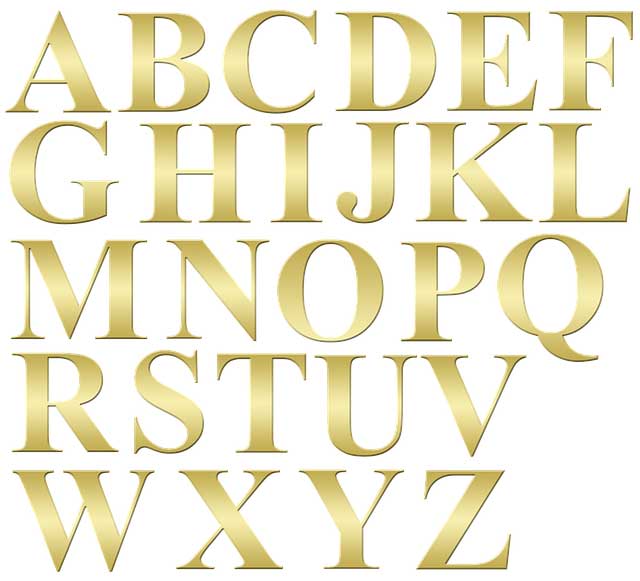
Typeface
The typeface you choose (i.e. your font style) can have a significant impact on the readability and style of your book.
Choose a typeface that’s easy to read and appropriate for the content of your book. Serif typefaces are often used for more traditional nonfiction subjects, while sans-serif typefaces are more commonly used for more contemporary genres.
Hierarchy
Hierarchy refers to the organization of content on a page. Use headings and subheadings to create a clear hierarchy of information, with larger and bolder text for more important content.
This will help your readers easily navigate your book and easily find the information they need. A well laid out table of contents in your front matter will go a long way in making your book easy to follow.
Contrast
Contrast refers to the difference between light and dark areas of your design. Use contrast to create emphasis and draw attention to important elements. For example, you can use bold text, or larger font sizes to make important content, like callouts, stand out from a sea of text.
Consistency
Consistency is key in typesetting. Use a consistent style and formatting throughout your book to create a professional and cohesive look. This includes things like line spacing, margin size, and font size.
Inconsistency is the enemy of a professional look and can hurt your reputation.
Alignment

Alignment is the process of ensuring that all the text and other elements on a page are lined up and positioned correctly. The goal here is to create a consistent and visually appealing layout that is easy to read and navigate.
There are two main types of alignment for nonfiction books: left-aligned and justified. Left-aligned text is aligned along the left margin, creating a ragged right edge. Justified text, on the other hand, is aligned along both the left and right margins, creating a straight edge on both sides.
They both have pluses and minuses that will depend on your particular design — your book designer will be able to assist in making the right choice.
For example, while justified text may seem like a more aesthetically pleasing option, it can actually create readability issues if you try to justify a narrow column of text next to an image, which can result in uneven word spacing and awkward line breaks.
White Space
White space is the area of the page that’s left blank or unmarked. It can be just as important as the content on the page itself.
By allowing certain elements to breathe and giving others more weight through contrast, you can use white space to guide the reader’s eye and draw their attention to important information.
When typesetting your book, it’s crucial to make sure there is enough white space to create a comfortable reading experience. Too little white space can make the text feel cramped and difficult to read, while too much white space can make the text feel sparse and uninviting.
Color
If color pages are an option in your book, the ability to present text in different colors can be a powerful tool in typesetting, helping to create contrast, emphasize key points, and make certain elements stand out.
However, it’s important to use color thoughtfully and intentionally. Avoid using too many colors or overly bright ones, as they can be distracting or overwhelming.
When using color in your book’s typesetting, consider using a limited palette and sticking to more muted or pastel colors that won’t clash with the content on the page.
What Software Programs Are Best for Typesetting?
There are many software programs that can be used for typesetting, but some are better suited for specific types of projects than others. Here are three of the most popular software programs.
Note that the top of the list is favored by traditional publishers and high-end assisted self-published due to their high cost, while the bottom of the list appeals to self-publishers who are bootstrapping their nonfiction project.
Adobe InDesign: This is one of the most popular and versatile typesetting software programs, used by the vast majority of book-design professionals in the publishing industry.
LaTeX: This is a typesetting system used for academic and scientific documents. It’s particularly well-suited for documents with complex mathematical equations and scientific notation.
Microsoft Word or Google Docs: While not as powerful or specialized as InDesign or LaTeX, both these tools are a good option for typesetting simple text-based documents with nominal layout requirements.
Ultimately, the best software program for your project will depend on your specific needs, budget, and level of experience.
Wrapping Things Up
Typesetting is a critical part of the book design process, and it can make a big difference, not only in the readability of your book, but also in how it’ll be received in the market.
If you’re not confident in your typesetting skills or don’t have the time to typeset your book yourself, consider outsourcing the work to a professional book designer. Many freelancers and high-end self-publishing companies offer interior page layout services at reasonable rates.
But whether you do this work yourself or outsource it, knowing the basic principles of typesetting and how to apply them to your nonfiction book will help you create a finished product that looks polished, professional, is a pleasure to read, and has market appeal.
Good luck, and happy typesetting!

Harry Wallett is the Managing Director of Cascadia Author Services. He has a decade of experience as the Founder and Managing Director of Relay Publishing, which has sold over 3 million copies of books in all genres for its authors, and looks after a team of 50+ industry professionals working across the world.
Harry is inspired by the process of book creation and is passionate about the stories and characters behind the prose. He loves working with the writers and has shepherded 1000s of titles to publication over the years. He knows first-hand what it takes to not only create an unputdownable book, but also how to get it into the hands of the right readers for success.
Books are still one of the most powerful mediums to communicate ideas and establish indisputable authority in a field, boosting your reach and stature. But publishing isn’t a quick and easy process—nor should it be, or everyone would do it!


Leave a Reply